25 August 2021
![]() 5 mins Read
5 mins Read

My favourite part of the uniform is probably the trench. It’s kind of my signature, but it’s also a classic piece that always looks contemporary. Even though Qantas is an Australian company, it flies all over the world, and I think people forget that elsewhere, London for example, can be freezing.
Probably the hardest part of the process was the testing involved – the uniform had to tick so many boxes. We had specialists who tested every aspect you can think of – pilling, shrinkage, fading, thermal testing, tearability, wearability, creasing, useability… I would have preferred to have 100 per cent wool, for example, but it didn’t stand up to the testing. In fact I thought that those restrictions would be limiting to the point where I wouldn’t be happy with all the fabrics, but actually I was. We ended up getting very, very good quality fabrics that are 80 per cent wool – Australian wool of course; that was the obvious choice.
The hat was the most controversial of the pieces – staff was almost 50/50 on whether they wanted it – but we surveyed the staff and the feedback was that they wanted to put old-world glamour back into flying. This one is made from recycled bottletops, which I love, and it’s practical; you can actually fold it up and put it in your bag, or store it on the plane, then pop it back into shape.
You know when you’re running through a foreign terminal, trying to find a staff member who can help you? Qantas wanted a uniform that would be very visible no matter where you were – that’s why the colours are at the top of the uniform. The colour scheme was one of the last things to come together. We already had the base of the uniform, the suiting, the red triangle, but it was all very ‘red, white and blue’ and I wanted to move away from that. I was in my studio when the red and the pink came together; they’re so vibrant, you can’t miss them.
The thing I used to love about coming back to Australia was arriving on the tarmac and seeing the guys in the shorts and long socks – you just wouldn’t see that in Paris [Grant is based in France]. Qantas wasn’t keen on keeping the shorts when we did the work uniforms for the technical ground staff, but I fought to keep them. When we presented the new look at the Hordern Pavilion, the shorts were one of the last looks we presented, and they got the biggest round of applause.
Of all the uniforms, I think this is the one that’s dated the most; it’s not my favourite. But I love that it’s so specifically ’80s. Yves Saint Laurent was major back then, and it was quite advanced for an Australian company to go international with their choice of designer. The uniform was also very popular with staff, I think partly because of its knitwear. There were sweaters and cardigans, which is one of the things I reintroduced; knitwear is such a practical thing for travel.
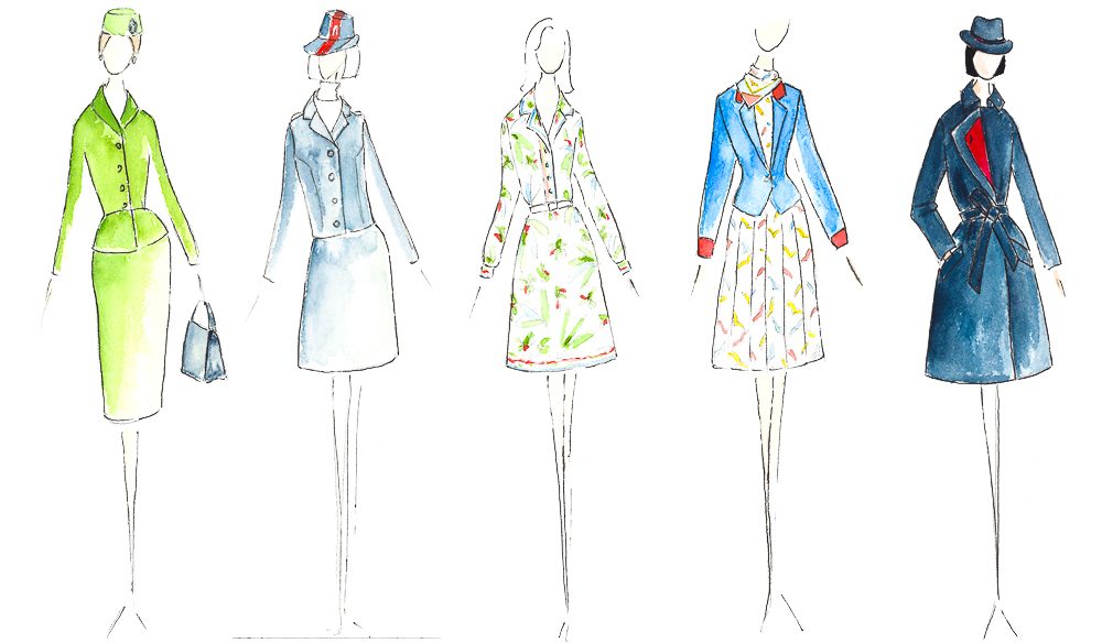
This is not something an Australian would design! It’s more like a European version of Australia. Very Surfers Paradise. It’s also very Pucci, which I love, and so specific to the ’70s. It’s actually the uniform that lasted the longest – apparently when Qantas wanted to renew the uniform after this design, they asked Emilio Pucci to participate on the judging panel, and halfway through the process he decided that he was the best one to do it, so he threw out the other designs and redid it himself! Or so the story goes…
This uniform was apparently hated – it only lasted two years. But I’ve got a funny fondness for it. It looks strangely dated for its time, more like a ’60s uniform than ’70s, but I love the hat. And the navy and red, of course, which may look familiar to you [laughs]. The name they gave this uniform, too, ‘the Redback’; I love that. As soon as you see the hat you can see why they called it that, but only an Australian would get the joke.
I find it strange that they used that green colour, but I think this was the chicest uniform of all; the perky hat, the tailoring. In those days they could have the uniforms made to measure, obviously they had a lot less crew then, but who cares? The fact that it was a tailored suit that needed to be fitted properly to every individual – that’s pretty good. Although I do wish they’d done a real ’50s-style uniform with a full skirt – it wouldn’t have been practical, but I’m disappointed about it.
1948 – David Jones
1959 – Saville Row Shirt Company ‘Jungle Green’
1964 – Leon Paule (in aqua)
1969 – Leon Paule (back for more, this time in red)
1971 – Madame Germaine Rocher ‘The Redback’
1974 – Emilio Pucci
1986 – Yves Saint Laurent
1994 – George Gross and Harry Who
2003 – Peter Morrissey
2014 – Martin Grant
LEAVE YOUR COMMENT